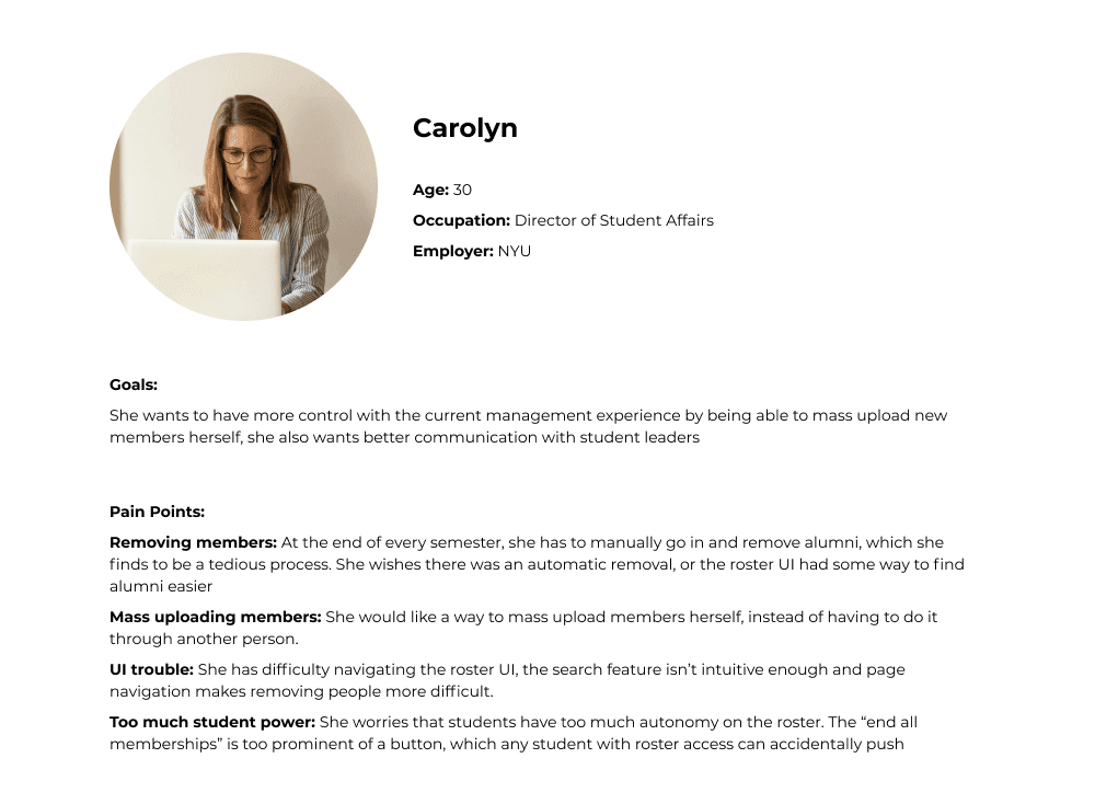
Persona
I conducted user interviews with branch administrators and student leaders of some of the clubs NYU has to offer, and created a persona based on their goals and pain points.
Discovery
User Flow
With the features in mind, I created a user flow that shows a user’s journey to manage a roster from start to finish.

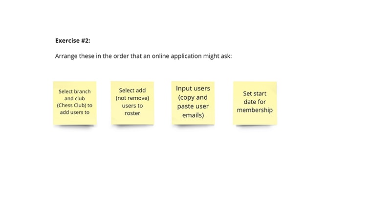
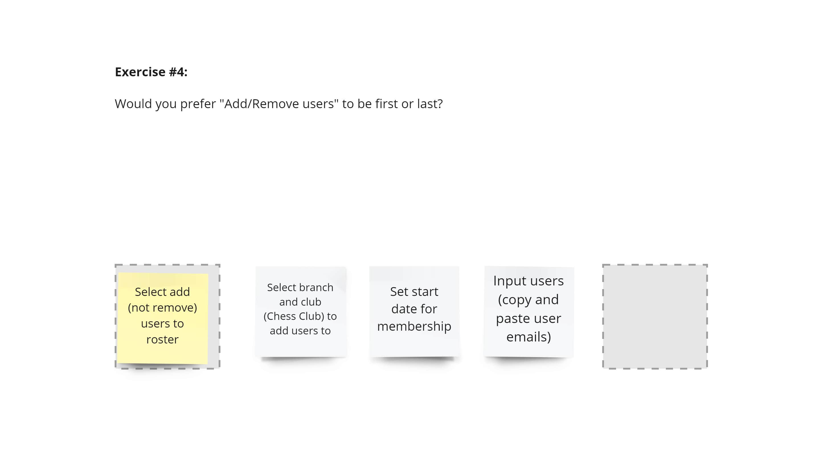
Card Sorting
The Manage Roster form would have sections to select an organization, the action the user wants to take (add/remove), the start or end date, and to input member information. We conducted some user testing to see which order would make the most sense to our users.


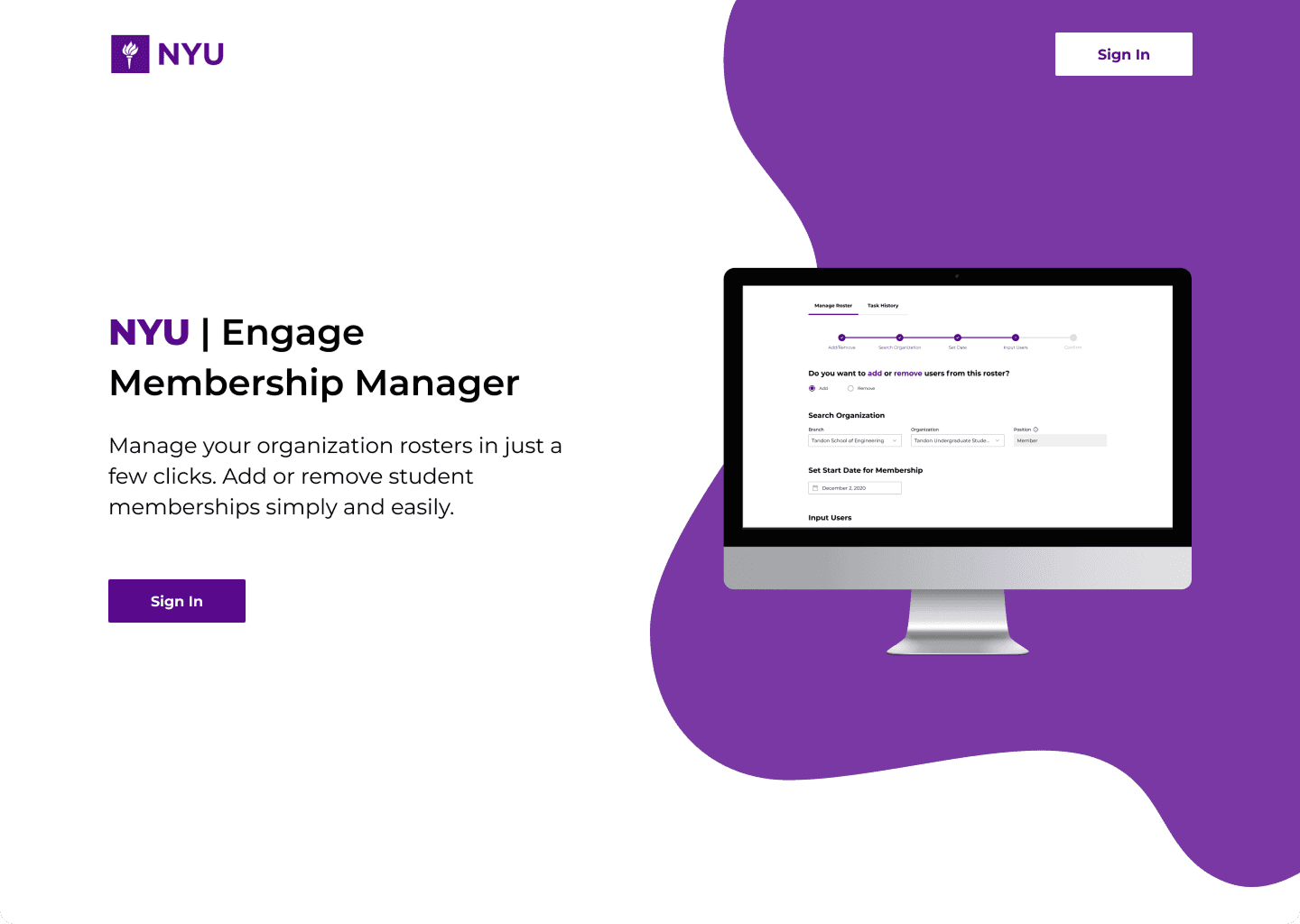
Landing Page
To access Membership Manager, the user can access the portal, which leads them to this landing page. To sign in, users must use the global NYU login and enter their credentials.
Manage Roster
Upon sign in, users are greeted with the Manage Roster tab, where they can fill out a form to add or remove students to a club roster.

Step 1 - Add or remove users from a roster

Step 2 - Select an organizational branch
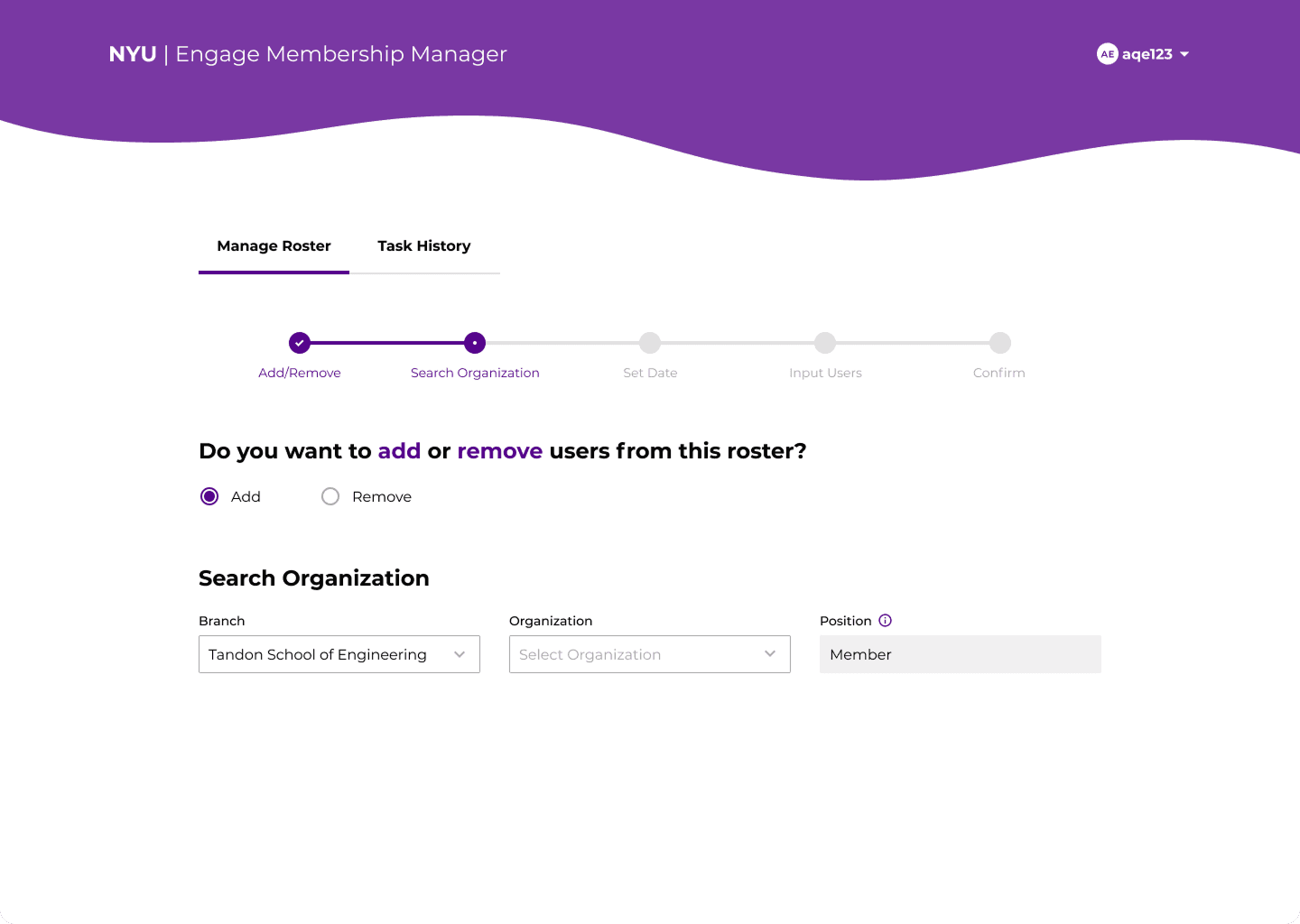
Step 3 - Select an organization

Step 4 - Select a start date

Step 5 - Input users
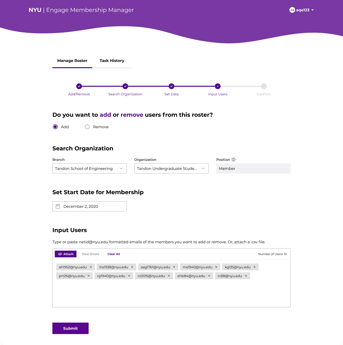
Step 6 - Submit

Step 7 - Review roster changes

Step 8 - Process roster changes
Task History
To view past actions, the user can navigate to Task History, where they can see a table of all the rosters they've managed in the past. The table will give them information like the organization, the number of users, and the status of the upload. The download button, which is available for 30 days after an upload, will give them a .csv file of users, and will show which ones upload unsuccessfully if applicable.

Error Handling
To accommodate every possible error case, I designed different error statuses throughout the process.

Step 1 - Add or remove users from a roster

Step 2 - Select an organizational branch

Step 3 - Select an organization

Step 4 - Select a start date
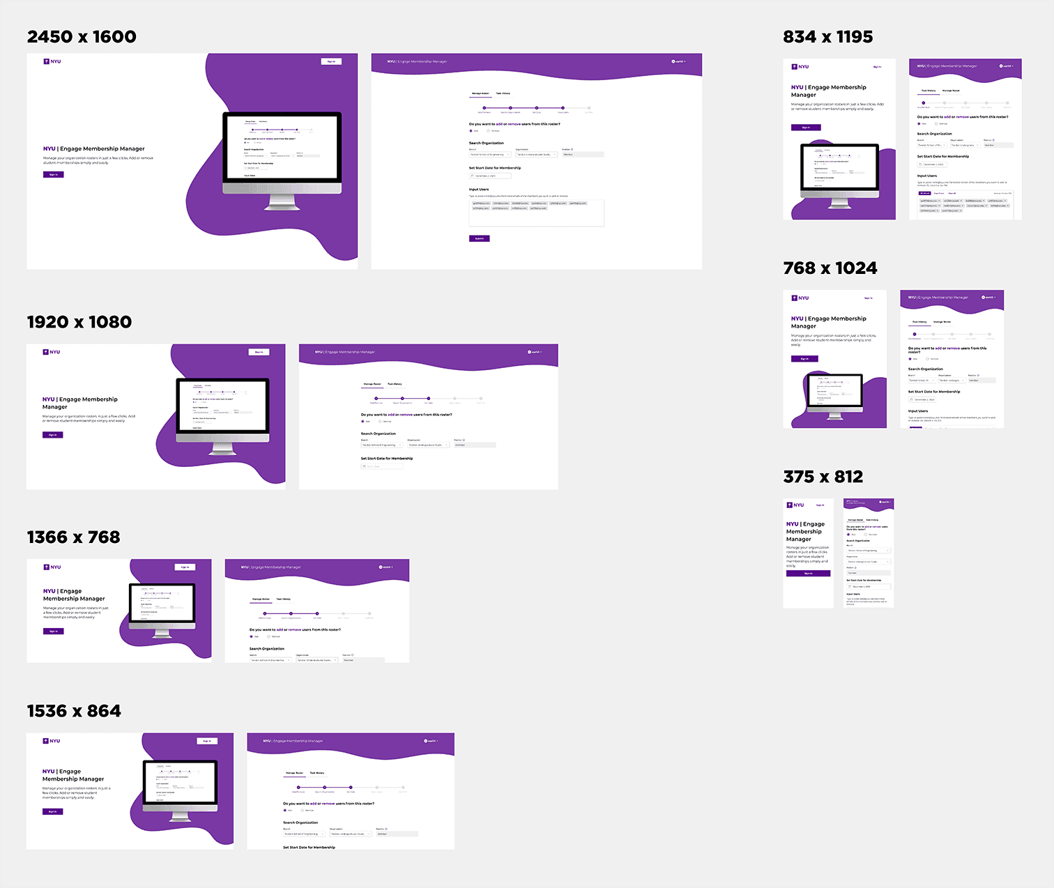
Responsive Design
Because some of the visual components are so complex, here's a look into my attempts at accommodating major screen sizes with the help of the front-end developer on the team! To achieve this, we created breakpoints based on certain popular screen sizes to resize the blobby elements of the design.
Conclusion
NYU Engage Membership Management launched in the summer of 2021. Because our user base was so small, usability testing was much more casual and quicker than usual. Some key takeaways from this project included:
Response Design
Making this product responsive was lower on our priorities but it made a world of difference when executed. I learned about breakpoints in design and best practices in scaling your layout, and also learned from the developers’ how much work is put it to ensure smooth responsiveness.
User Testing
This was my biggest dive into user research and testing to date. We worked directly with our user base on developing personas and understanding their pain points and user habits, as well as a miscellaneous sample of students and staff to conduct user testing for a more robust set of feedback to influence our design decisions.